The literary critic Tzvetan Todorov notes, “nothing is more commonplace than the reading experience, and yet nothing is more unknown. Reading is such a matter of course that, at first glance, it seems there is nothing to say about it.”
For hundreds of years, books have broadly been defined as vehicles in which thoughts, facts, or fabrications travel in one prescribed direction, from the author to the reader. There are, of course, different ways of reading and different kinds of books, but the basics are: One picks up a book, holds it open, turns the pages, and deciphers linguistic symbols or recognizes and interprets illustrative information. There are, however, instances where this linear logic of reading a book is broken, where the form of the book adds new layers of meaning. These objects “break” and “reassemble” the common understanding of book and reading, and in this process they generate interactive encounters, foregrounding not only the voice of the author, but also that of the book designer and the reader who interprets the book’s form.
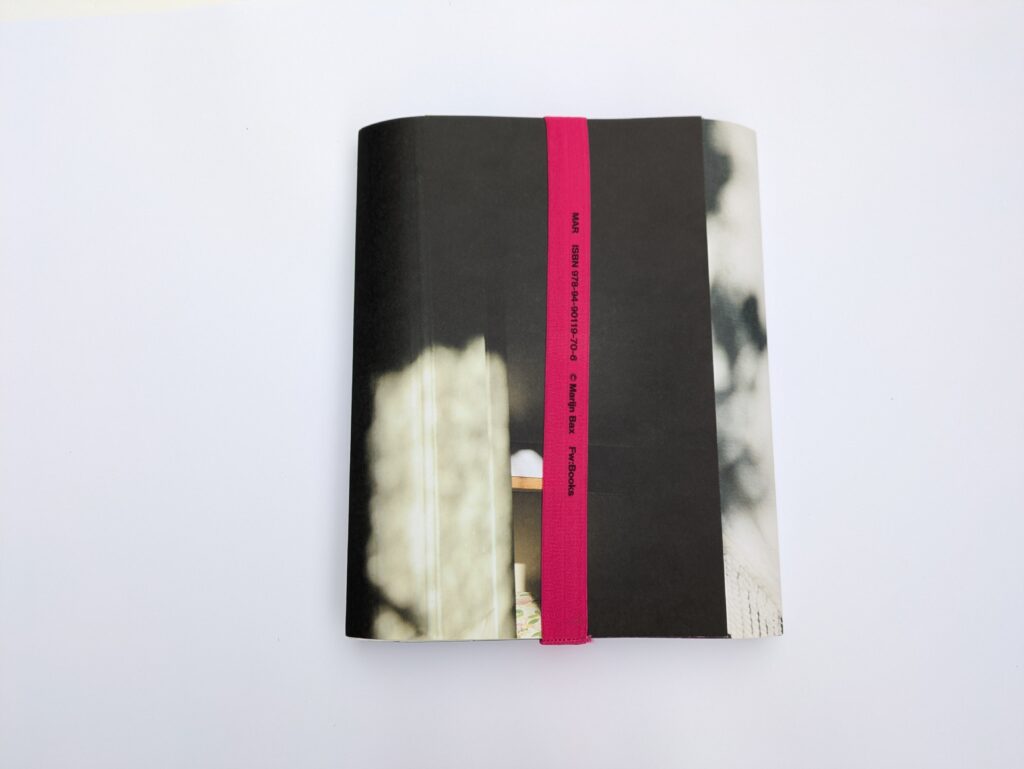
Earlier this year, I showed my graphic design students MAR by Marijn Bax (2018, Fw:Books) as an example of a “paper object” that tells a story with only a few words. I didn’t mean to challenge their understanding of what a book is or ought to be. MAR is an unusual book—as many artists’ books are—but a book, nonetheless.
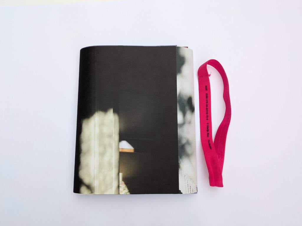
The discussion that followed revolved around the “reading” of this object, which students found peculiar. MAR consists of a collection of different-sized papers, folded in various ways, some printed double-sided, some single-sided, on four different paper stocks. They fold down to the same size, 17 x 23.5 cm, and sit in a paper folder that is kept closed with an elastic band.
designed by Mevis & van Deursen. Fw:Books, 2018.
6.7 x 9.25 in (17 x 23.5 cm), 256 pages. Softcover.
ISBN 978-94-90119-70-6. Photos: Catalina Zlotea.
The words printed in black on the band in the Univers typeface are big enough to convey information without making a distinction between the book title, author, publisher, and ISBN. This graphic statement intentionally adds to the ambiguity of the object and calls for the reader’s visual literacy skills to decipher the information.
The book is about Mar, a woman who died in 2017 at the age of 102, but more specifically it is about how Bax knew Mar, a story told through the photographs the artist made of the women over the span of ten years. The reading of this book is performative, and Bax transforms it into a deliberately voyeuristic act. The physical gestures that are required to examine the publication go beyond “flipping pages”; one needs to fold, unfold, refold, and peek through papers, a reading process like an illicit scavenge through someone’s things.
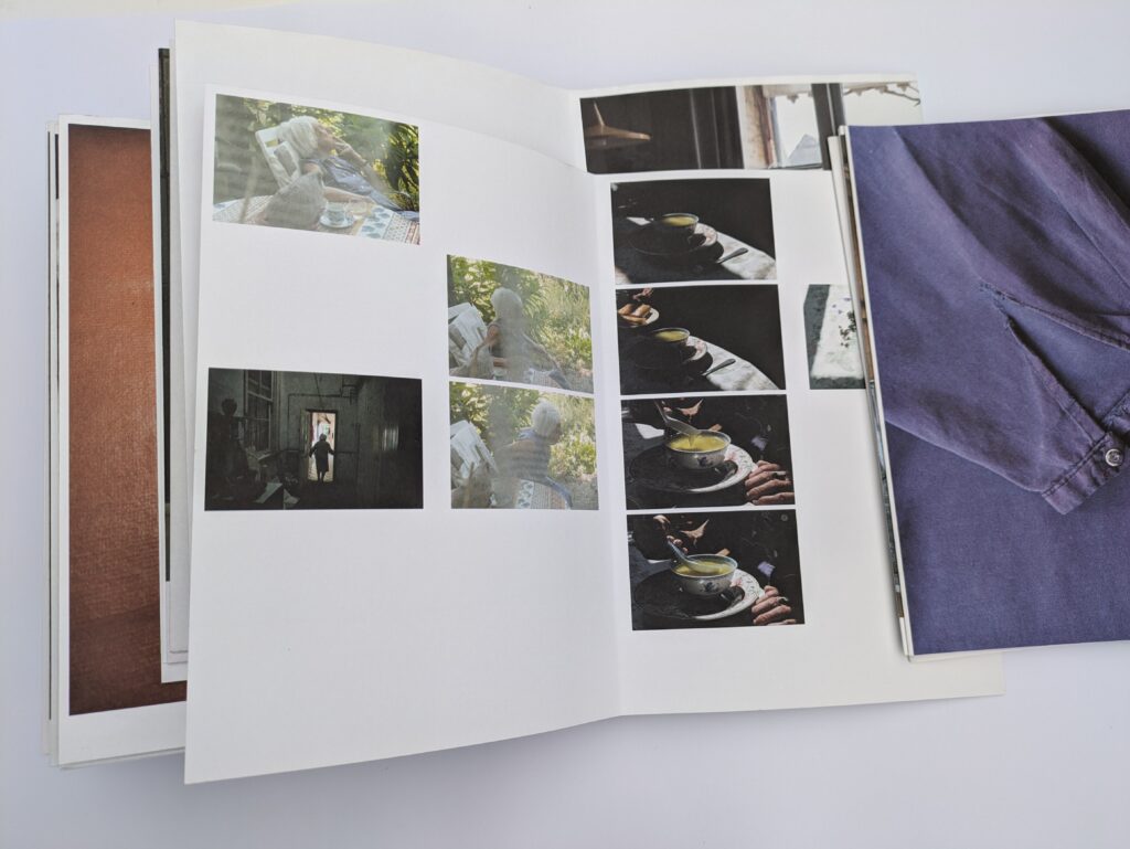
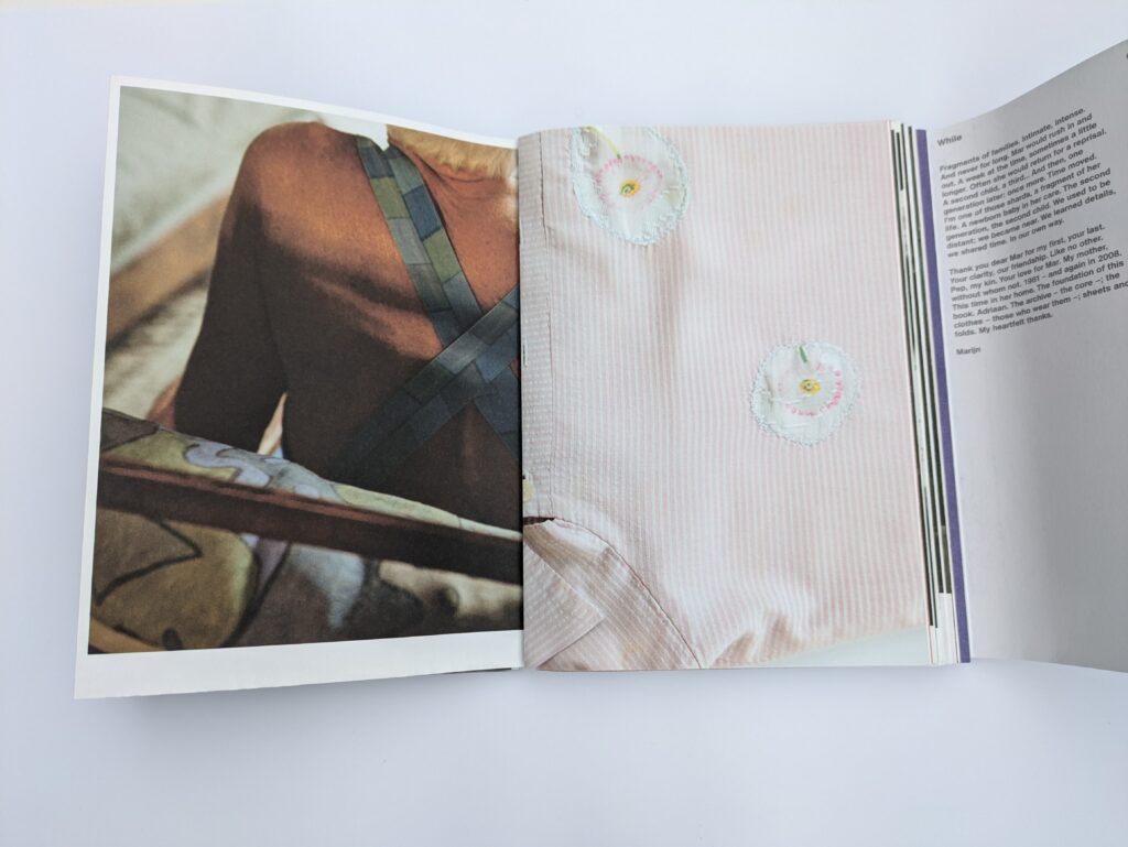
As Bax explains in the introductory text, the book is meant to fall apart, and the reader must “fit it together again” and accept that “order doesn’t matter, however you look at it is valid.” MAR doesn’t only allow the reader glimpses into Mar’s home. It offers a sense of proximity that allows them to discern creases on her skin, rummage through her drawers, touch her clothes, and find hidden objects in her house. The extent of this probe depends solely on the curiosity and the voyeuristic proclivities of the reader, and this process ultimately produces an unpredictable number of image combinations and interpretations of Mar’s presence.
In his book Borrowed Territories, Lucian Bran juxtaposes images from the TV miniseries Hatfield & McCoys with landscapes he photographed in Brașov, Argeș, and Ilfov, counties in Romania where the series was filmed. The American production, shot in 2012, borrows contemporary landscapes from twenty-first-century Romania as a backdrop for the “true story” of two families from Kentucky and West Virginia in the years following the American Civil War. In his book, Bran bridges the then and now and the here and there to demystify the film’s narrative, creating a new “true story” that foregrounds the landscapes as main characters.
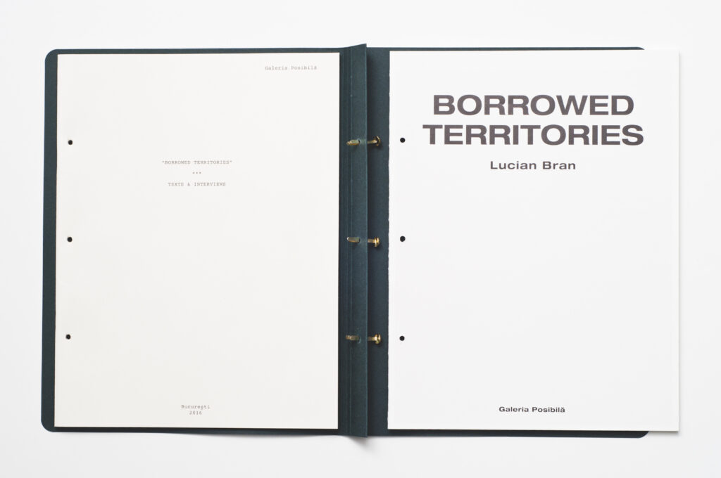
Whereas MAR, through its lack of binding, immediately challenges the reader and invites them to continuously deconstruct, construct, and reconstruct the book—and ultimately the narrative—Borrowed Territories, an art book published in 2016 by Galeria Posibilă in Bucharest to accompany Lucian Bran’s exhibition, calls for the reader to engage as though a detective, searching for clues.
Alexandra Manole and Lucian Bran, designed by Alin Cinca,
edited by Alexandra Manole. Galeria Posibila, 2016.
8.5 x 11.5 (22 x 29 cm), 108 pages. Edition of 300.
Printed in Romania by Fabrik. ISBN: 978-973-0-22736-9
Photos: Claudiu Stefan.
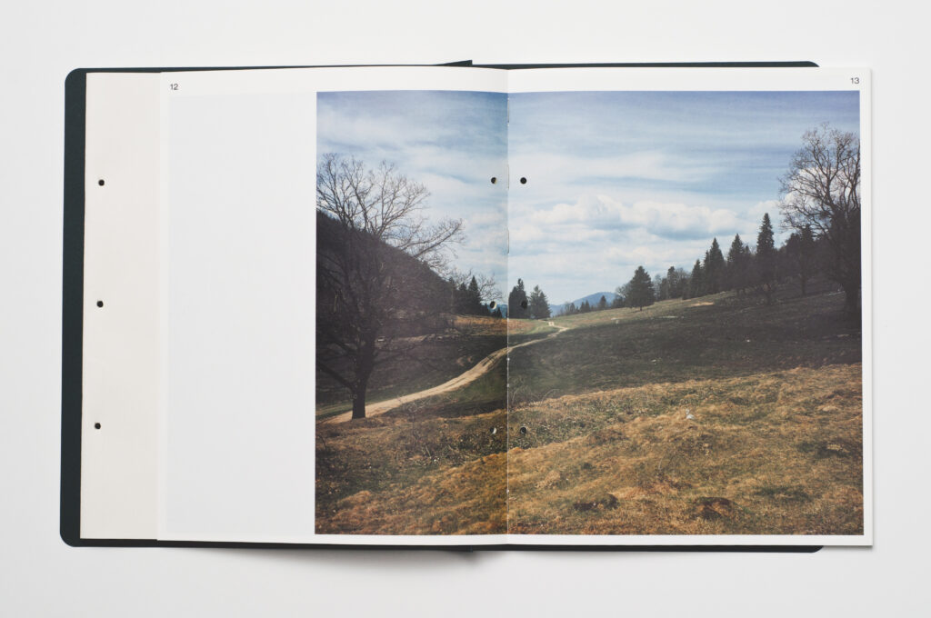
Borrowed Territories is structured in two sections. The first part—a thirty-six-page booklet, printed on a rough, uncoated ivory paper—introduces Bran’s exhibition and features two interviews with the artist. The design suggests a screenplay through its use of a typewriter typeface, brass-brad binding, and idiosyncratic layout aspects. The second part—72 pages, section-sewn in nine signatures of 8 pages each—showcases the artist’s photographs printed on white coated paper. While the two sections could function independently as two booklets, the three brass brads, fed through holes punched through both sections, connect them to construct an engaging binder-book. The two parts of the book complement each other in terms of content, but contradict each other in their form. Together they convey the essence of the book: a script that was not written for a film that was never shot.
Borrowed Territories, which had a print run of 300 copies, successfully mixes industrial and artisanal techniques, with the latter features dominating the overall look and feel of the book. The reader needs to release the paper binders in order to access each section. The unusual binding that allows for two books in one works particularly well for the booklet showcasing photographs, where the sewn sections allow each spread to lie completely flat.
By taking apart this book, the reader not only gets a clear view of the photography, but also discovers text concealed in the spine that otherwise, when bound, folds inward. This hidden message quotes one of the actors in the show: “You couldn’t shoot this film in West Virginia and Kentucky today, the way we are shooting it, these wide, ample panoramic shots…” This straightforward sentence encapsulates Bran’s intention: “I was interested in landscapes untouched by human intervention … I was also intrigued by what defines the identity of a place, how it evolves over time, and how a place absorbs and preserves a series of memories.” Just as the covers physically hold the two parts of the book together, this contrivance—a tongue-in-cheek final performative production attribute—introduces a statement that conceptually wraps it.
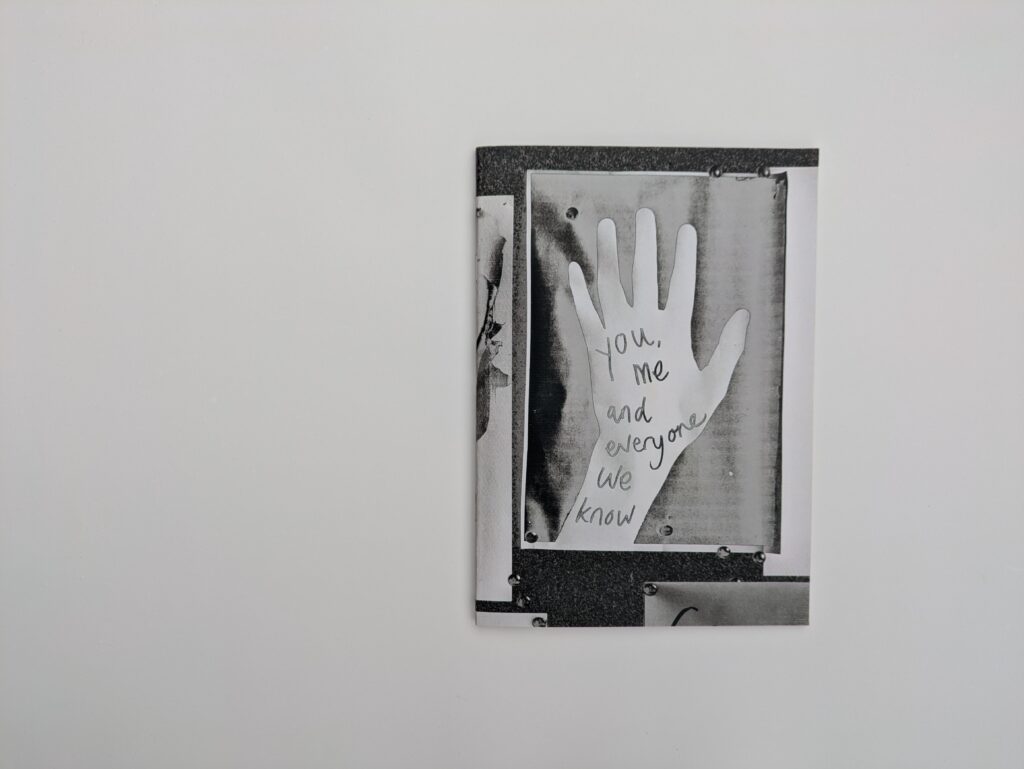
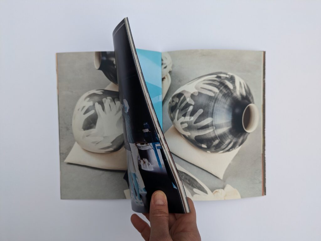
Unlike Borrowed Territories, where the reader’s experience is enhanced by the design of the book, You, Me and Everyone We Know, an exhibition catalogue produced by Gallery FUMI in London in 2023, intentionally impedes the process of reading. The publication introduces a different paper stock with every turn of a page, and its 48 pages and covers are designed and then bound as “printer spreads,” where instead of showing photographs on consecutive pages, the booklet requires the reader to continuously flip forward and backward to examine the entire image. The typeface used here further contributes to this uneasy reading. Century Megafont, an amalgamation of twenty-six fonts created by the graphic designer Fraser Muggeridge—whose studio designed the publication—purposefully breaks fundamental typographic principles by ensuring that each letter is displayed in a different font from the one preceding it. To the trained eye of a typographer or a book designer, this is readable chaos; for the common reader, perhaps not. Muggeridge puts forward a publication in which the roles of the printer, binder, and type designer become prominent through the wrongness of otherwise ordinary—most often unnoticeable—attributes of a book: the optimal readability of the text and the established relationship between a verso and a recto page.
designed by Fraser Muggeridge studio. Gallery FUMI, 2023.
5.9 x 8. 25 (15 x 21cm), 48 pages.
Photos: Catalina Zlotea.
MAR, Borrowed Territories, and You, Me and Everyone We Know are not singular, or even extraordinary, examples of books that require unconventional interactions. They are, however, powerfully illustrative of different approaches to mitigating the traditional power dynamics between author, designer, and audience through the physical form of the book.
Jacques Derrida famously announced that the reader is, in fact, the one who “writes” the text and that nothing can be found outside of it. Around the same time, Roland Barthes proclaimed the “death of the author” in his seminal essay. Similarly, Jonathan Culler’s theory of reading chiefly focuses on the reader’s interpretations, and Stanley Fish also believes that the meaning of a literary text is fundamentally linked to the reader’s experience. It is not only literary criticism that pays close attention to readers. Literary works, too, have contemplated the dynamic between the reader and the narrative. Italo Calvino, in If on a Winter’s Night a Traveler, places the reader as the protagonist of the story.
For the artists’ book, the reader’s relationship with the book as object is still to be reflected upon. MAR, a book that is the sum of multiple variations of the same content, calls on a confident (or otherwise careless) reader whose actions are central to the nature of the publication. Meanwhile, Borrowed Territories expects the opposite, a reader who is patient, dexterous, and inquisitive; its structure and design lead readers through a process, revealing the key hidden message within the spine, which assures them of the validity of their reading. The opposite can be said about You, Me and Everyone We Know, which seems to make no effort to support the reader but rather attempts to obstruct them, delivering an intentionally “incorrect” book; these mistakes are, however, carefully calibrated, foregrounding not only the designer and their primacy, but also the reader’s part in constructing meaning.
Questioning the ontology of a physical book is a moot point for this discussion. The three publications surveyed here make strong claims for their identity as books, and none pose challenges that haven’t already been addressed by artists concerned with the medium. Since the mid-twentieth century, when Dieter Roth put forward the notion of a book as an object to be engaged with as art, rather than merely a vehicle for information, the definition of a book has expanded almost to the point of being all-encompassing. As long as it opens, it can be called a book. MAR’s lack of binding and the control it offers readers over the narrative are effective devices reminiscent of Roth’s Volume 8. The idea of a book as a document of practice, beautifully demonstrated in Borrowed Territories, is a recurrent approach introduced by Marcel Duchamp with his publication The Green Box. You, Me and Everyone We Know is a seemingly uncomplicated object, but its idiosyncratic typeface nods to the compelling concerns of Isidore Isou and other French Lettrists of the mid-twentieth century.
When the physical attributes of a book call for unusual interactions, the confidence, familiarity, curiosity, dexterity, patience, and expertise of readers are factors that influence the depth of reading and thus the meaning of the text. MAR, Borrowed Territories, and You, Me are not books as art—precious, handmade, unique, or produced in small editions—nor are they mass-market publications. They live in a space between these dichotomous worlds, all three in their own ways successfully (re)negotiating peculiar and new relationships between authors and readers, objects and meanings. They are examples of agile and important dialogues between the makers of the books and the readers, who are active interpreters, rather than mere receivers of authoritative ideas. It becomes fair to wonder whether, in such cases, it is the reader who reads the book or whether, perhaps, the book, in its various deconstructed forms, “reads” the reader and portrays them.
designed by Mevis & van Deursen. Fw:Books, 2018.
6.7 x 9.25 in (17 x 23.5 cm), 256 pages. Softcover.
ISBN 978-94-90119-70-6. Photos: Catalina Zlotea.
Alexandra Manole and Lucian Bran, designed by Alin Cinca,
edited by Alexandra Manole. Galeria Posibila, 2016.
8.5 x 11.5 (22 x 29 cm), 108 pages. Edition of 300.
Printed in Romania by Fabrik. ISBN: 978-973-0-22736-9
Photos: Claudiu Stefan.
designed by Fraser Muggeridge studio. Gallery FUMI, 2023.
5.9 x 8. 25 (15 x 21cm), 48 pages.
Photos: Catalina Zlotea.