Understanding the ways that artists’ books communicate their meaning is akin to learning a new language. Misunderstanding and confusion are part of the process. Some of them seem nearly impenetrable, flaunting the formal conventions of narrative and structure that we expect from a traditional book.
But enigmatic is not inaccessible. Somewhere between the artist’s conception and the viewer’s perception is that elusive plane where meaning emerges. Susan Sontag captured this when she wrote, “Even the simplest sensation is in its totality, indescribable. Every work of art, therefore, needs to be understood not only as something rendered, but also as a certain handling of the ineffable.”[2] This essay explores the many languages that makers use to convey meaning, including weight, substance, spatial orientation, distortion, abstraction, and anticipation.
How does an educator guide new readers in this unfamiliar language? Can it even be taught? If every reader’s response is inflected by their own emotional landscape, then we can only ask leading questions, not provide definitive answers. The visual and tactile features of artists’ books embody meaning that invites examination, especially when the materials and typographic choices are surprising. Outstanding artists’ books do not explain what they are about—they lure us inside and provoke a response through multiple nontextual attributes.
There is a moment when a reader’s comprehension shifts from mechanical reading to internalized reading. It might be called attunement, as in language acquisition, when subtleties of intonation, expression, cadence, and even silence convey meaning. Artists’ books provoke that same elastic and sensory experience.
Bookmaker Ken Botnick said it well: “Artist books are to the world of books as poetry is to the field of writing.”[3] Like poetry, where abstraction and nuance prevail, artists’ books belong to that same ineffable realm. What follows is an investigation of eight books and how they communicate their content to the reader. What causes them to resonate over time, long after the reading is done?
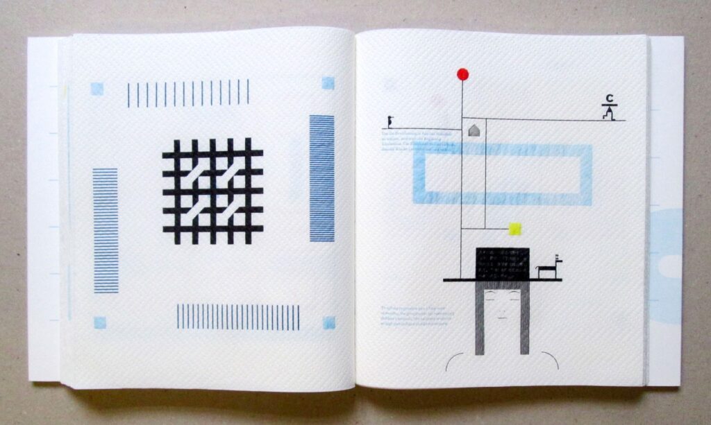
[It is bitter to leave your home], Romano Hänni.
Hand printed, Switzerland, 2017. 9.25 x 10.5 in
(23.5 x 26.6 cm), 64 pages, Edition of 87.
Five colors hand printed, letterpress on paper towels,
numbered in slipcase. Photo: Ruth R. Rogers.
The term artists’ book embraces a vast range of forms and production methods, to the extent that classification always generates more questions than it answers. Is any handmade book an artists’ book? Is anyone who makes a book by hand an artist? Is a digitally printed or photocopy book excluded? How can terminology such as accordion or flag book capture the “geist” of the work? This does not diminish the labor of librarians and bibliographers, whose extensive catalogue descriptions are critically important as access points for the researcher. But a lengthy paragraph detailing the specifics of paper, typeface, graphic methods, and other formal attributes does not predict how a reader will understand a work. Meaning is made through cognition; thus, every reader will take a different meaning from a book. Johanna Drucker proposes that the “materiality of a text is an event, rather than an entity. The event is the entire system of reader, aesthetic object, and interpretation—but in that set of relations, the text is constituted anew each time.”[4]
Drucker, like Sontag writing about a work of art, contends that the book-reader interaction is organic and individual. Why, then, should artists’ books be labeled or categorized according to their physical attributes? In the books discussed here I make the case for evaluating the artists’ book not in terms of its traditional categorization, but rather what it does with its own language.

Consider, for example, the effect of weight as a feature of Romano Hänni’s Es ist bitter, die Heimat zu verlassen (It Is Bitter to Leave Your Home), Basel, 2017.
With text in German, Japanese, and English, Hänni tells the story of a family who have to leave their home after the Fukushima nuclear disaster. The narrative is told mainly in typographic symbols, except for the opening sentence: “The perpetrators are among us.” It is aimed at those who tried to cover up the causes and effects on the residents whose homes were there. Hänni’s book is letterpress printed—astonishingly, on paper towels. Could there be a more apt metaphor for a disposable product used to clean up accidental messes? Relative to its dimensions, the book is deceptively lightweight and fragile. The choice of paper towels as a substrate to transmit the story of expendable lives has an impact on everyone who handles it. As the unspooling of the book reaches the end, the final image is a tear-stained symbol of Japan.
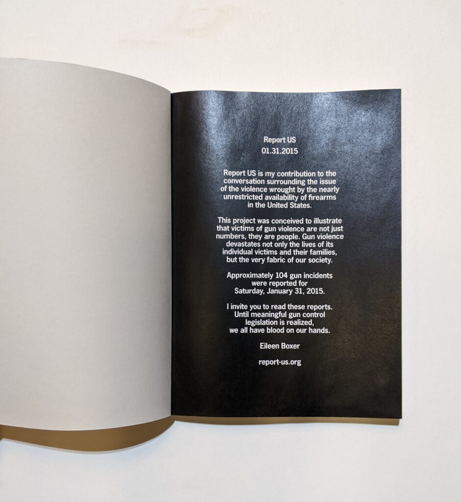
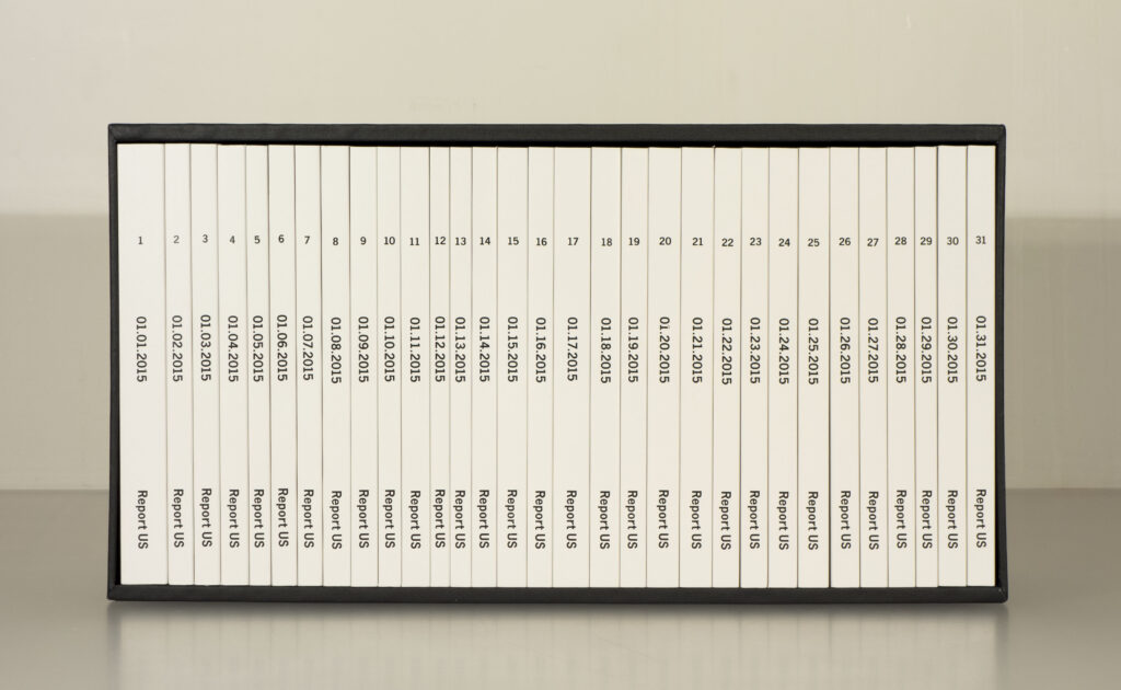
Against the almost weightless feel of Romano Hänni’s book, the contrast of Eileen Boxer’s Report US (2016) is stark. Boxer is engaged in an ongoing public project about the violence brought upon society by the nearly unrestricted availability of firearms in the United States. This box of thirty-one volumes documents gun violence incidents for the month of January 2015, one per page, one bound volume per day.
Hand printed, Brooklyn, NY, 2016. 5.9 x 7.9 in
(15 x 20 cm), pages range from 138 – 366.
Edition of 14. Packed boxed set of 31 perfect
bound volumes, digitally printed in slipcase of wood
and Eska board wrapped in black vellum and
lined in black paper. Photos courtesy Eileen Boxer.
Boxer has used published data to force the reader to reckon with the sheer volume of incidents, naming people and places so that they are not anonymous. The language of this set of books is its weight and size. By transforming enormous amounts of faceless government data into physical form, the artist makes it real; the viewer must confront accounts of individual violence on every page and then internalize the weight of only one month of statistics. The boxed set edition is called The Dailies. It weighs about 25 pounds.
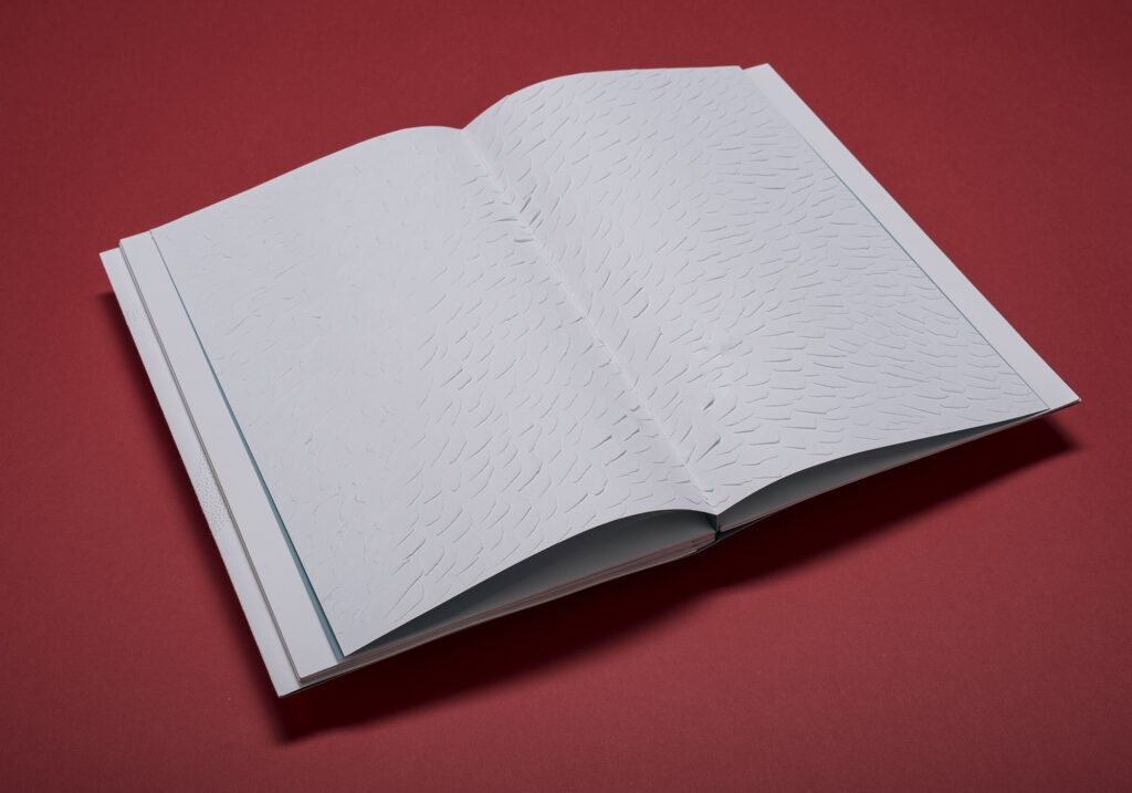
Naturally, the size and weight of a book has an immediate impact on the reader, often before one even arrives at the contents. A more subtle language is that of open space and the landscape of the page, demonstrated by Patrizia Meinert’s Ophelia (Halle, 2012, edition of 10).
In this stripped-down, alternative version of Shakespeare’s Hamlet, Ophelia is the one character who has a voice, the leading role. Meinert has printed only Ophelia’s spoken lines, leaving the other characters’ lines in the original space on the page, but without their words. The page turning must proceed slowly for the reader to recognize that the white space of the page is not mute, but a simulacrum of time elapsing.
Opposite the text in occasional interruptions is a sheet of translucent turquoise paper that shimmers, giving the impression of water. But something else is being communicated here. The text pages are interrupted by “paper wounds” that visualize Ophelia’s ordeal on their surface.

Burg Giebichenstein Kunshochschule Halle
(University of Art and Design), 2012. 47 pages.
Edition of 10. Digital print, hand-dyed paper,
paper alterings and cuts, pamphlets sewn on a
concertina fold. Photos courtesy Patrizia Meinert.
Some have said it reminds them of rippling water; others have likened it to a scream. Meinert compounds Ophelia’s anguish with a startling surface treatment on the covers.
A perfectly rendered italic O emerges: not printed, but manifested in pinpricks.
This effect is achieved by pushing a pin alternately through both sides of the paper to give it a raised dimension, like a scar. It must be touched for full impact. Meinert has addressed themes of time and space in her book Simultanéité (2016) and the concept of human skin as an intimate personal map in Carte d’Identité (2017). With its slow progression of open space and Ophelia’s voice interrupted by violent cuts and wrapped in pinpricks, her rendition of Hamlet becomes a powerful mirror for Ophelia’s emotional state.
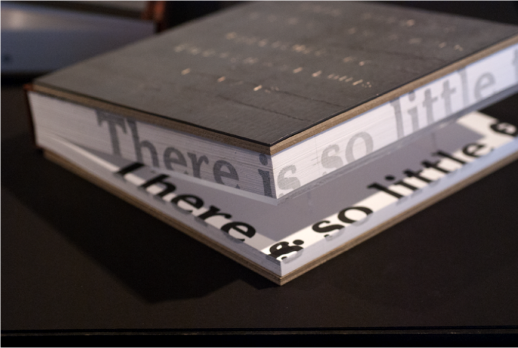
Another book that uses the flow of open space and the movement of single lines of text to moderate the pace of reading is Sara Langworthy’s On Physical Lines (2015).

Maxwell. Hand printed and bound, Iowa City, 2015.
8.5 x 13.5 in (21.5 x 34.3 cm), 44 pages.
Edition of 25. Letterpress, photopolymer, linoleum,
handset Univers type, simplified binding.
Photo courtesy Ruth R. Rogers
Langworthy’s work often explores the unexpected intersections of science, philosophy, and the visual arts, finding hidden poetry in the laws of physics and the universe.[5] On Physical Lines handles this theme through an unlikely text by the nineteenth-century scientist James Clerk Maxwell, whose words, written almost 150 years ago, are excerpted in the text of Langworthy’s book.[6]
Every spread features graceful swooping and arcing black lines printed over blocks of gradient color. Langworthy photographed the patterns of power lines overhead in her rural Iowa neighborhood and then made them into drawings. Her research in physics and mathematics led her to Maxwell’s theories, and she was immediately struck by phrases that seemed to speak directly to her drawings of the power lines: “Lines of force as something real, the lines avoid each other and are dispersed into space … there was poetry woven into Maxwell’s rational intellectual search.”[7]
The layout of the book is intentionally engineered to create a slow pace of discovery, as the reading of concrete poetry demands. With lines, graceful and weblike, moving across every opening, the eyes wander and come to rest on fleeting passages of Maxwell’s self-probing thoughts: “If we could account for the phenomena of attraction what explanation could we give?” Imagine how differently his text would be received in its original nineteenth-century formal page layout, without the halting cadence and fragile suspension that Langworthy plucks from it. She stretches entire sentences into thin fragments that appear at the upper edge of the image and then reappear as completed thoughts only by the reader shifting their gaze to the lower image edge. Sometimes parts of a sentence floats in the middle of the spread without punctuation, becoming an essential and existential line among the power lines.
The fragmented lines of Maxwell’s physics analysis become a reflection on the human condition, printed on a shifting drape of translucent color:
“the language of others proves erroneous,
does not account for the phenomena we are dissatisfied
we attempt illustrations to assist the imagination
We attempt to explain the origins of the observed— we consider
remarkable analogies….” “we are dissatisfied”
Even Langworthy’s choice of typeface, hand-set Univers, enhances the minimalism of the poetry. With no distracting serifs or varying weights, no upper or lower case, and barely any punctuation to anchor the fragmentary ribbons of text, the typeface mirrors the slender and tenuous thread of Maxwell’s poetic words: “If we can connect the significance, we shall have found a theory.”
Opaque as the principles of physics may be to many of us, Langworthy’s book unlocks new meaning from Maxwell’s text. Physics and philosophy merge on the page through composition, color, and movement—a universal tongue.
From the language of spatial and rhythmic features, we come now to a book’s substance, literally. Johanna Drucker, with more than a hint of sardonic wit, points out that “materiality is a word now much in vogue” and wonders whether it has to do with the appetite of the “pixel-plagued bit-weary” reader for intellectual engagement that is not virtual.[8] Accomplished artists of the book, however, are not newcomers to the possibilities of material as embodiment of meaning. Nor were their antecedents, those medieval bookbinders who armored massive liturgical books with brass bosses and clasps. They knew that they were making the power of the Church manifest.
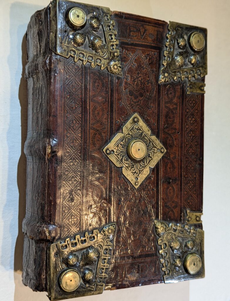
Wittemberg, 1524. Wellesley College Library.
Photo Courtesy Ruth R. Rogers
What effect does material have on perception? Carolee Campbell’sThe Persephones (Ninja Press, 2009), which features the poems of Nathaniel Tarn, is a good place to start.
Ninja Press, 2009. 14.25 x 9.25 in
( 36.8 x 23.5 cm), 48 pages. Edition of 85.
Printed letterpress on dampened Domestic Etching,
folios held in a goat parchment cover, protected
by a hard-sided chemise wrapper covered
in deep green Asahi Japanese silken cloth.
Photo courtesy Carolee Campbell
Tarn’s writing handles themes of antiquity and the permeable barrier between life and death. It requires a nuanced presentation without concrete imagery.
The book consists of twelve unbound folios, each painted and printed by Campbell. Though each “Persephone” can be read as a single poem on a single page spread, there is a continuous narrative from the first to the last, beginning with the opening vision of Persephone in a meadow, spied on by Hades, who determines to abduct her to be his wife. Here Campbell sets the stage, with broad dark strokes of smoky sumi ink hovering above the text of “The First Persephone”:
Lying face down, earth […]
pulled from below by the hands of undergods,
dragged down from below into the earth […]
And like a ship sinking into an oily sea,
slowly, down down down, she goes like a scarf,
but a scarf of lead
in a sea of lead. And the seasons saying no all the time, trying to bud and to leaf.
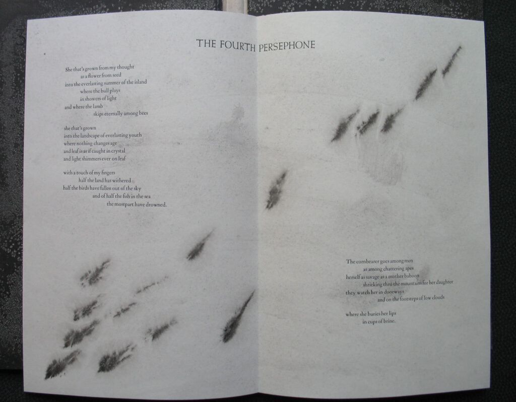
Disorientation is intentional. To read the book is to encounter Persephone’s terrifying abduction and forced descent into the underworld. Every poem is hidden on the inner side of a folded sheet of paper, so the reader must uncover it. Access to the text is only possible after handling the outer folds, which are a curtain of black ink—a dark interlude blocking the entrance to each poem. Campbell hand-painted each bifolio on both front and back using sumi ink sprinkled with salt. After the salt dried, the crystals were brushed off, leaving their almost three-dimensional white ghosts on the page.
Campbell’s decision to leave the folded sheets unbound heightens the sense of expectation and uncertainty. Each time the reader comes to the end of a poem and embarks on a new one, they must, like Persephone descending, pause at the entrance to the underworld, with its deposits of salt on a dense carpet of black, endless night. Mineral, here, is metaphor.
Campbell’s collaboration with Tarn is like a choral performance in nine parts, presented to its audience in the only substance consonant with the ancient myth of death and rebirth: animal skin. Each copy’s unbound signatures are enclosed in a wrapper of goatskin parchment. Not only an ancient writing substrate, parchment is a physical reminder of Greek religious sacrifice to the gods, in myth and in history. Campbell’s vision required a full skin for each book, with all its echoes of a once-living creature. It still breathes and responds to temperature and humidity in one’s hands. The inspiration to use animal skin grew out of her research into ancient practices of sacrificial ritual and its connection to the inevitable cycle oflife, death, and rebirth.[9] The Persephones is a fusion of visionary poetry and the enduring presence of the underworld, transmitted through salt, ink, and skin.
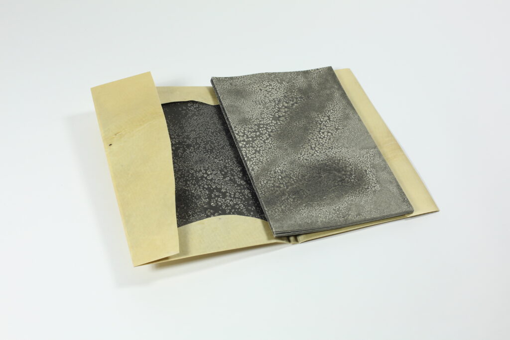
Delving deeper into the effect of a book’s material on the reader, another outstanding example is a work by Veronika Schäpers, Die Nase (The Nose), printed in Tokyo in 2009.
Ryunosuke Akutagawa. Handmade, 2009.
13.5 in x 18.9 (34.5 x 48 cm), 32 pages.
Edition of 46. Letterpress on Mitsumata paper,
Japanese binding with vellum strips in
a white cover made of kozo-ganpi cardboard,
case made of semi-transparent PVC Jelly
film, silicon cords and neodymium magnets.
Photo courtesy Veronika Schäpers.
The eerily fluid and slippery substance of the book’s limp covers makes the first impression on the reader. Its meaning becomes clearer upon the reader’s introduction to the text.
Schäpers’s usual method of “investigative bookmaking” led her to concentrate on the theme of male vanity in Japan, where she was intrigued to find salons catering to men’s skin and hair. Her book contains a short story by Ryūnosuke Akutagawa, printed in Japanese along with its first German translation by Jürgen Stalph. Akutagawa describes a vain and selfish Zen priest from the Heian era who agonizes over his extremely long nose. He attempts a disfiguring remedy, only to realize in the end that no one noticed his nose before he tried to change it.
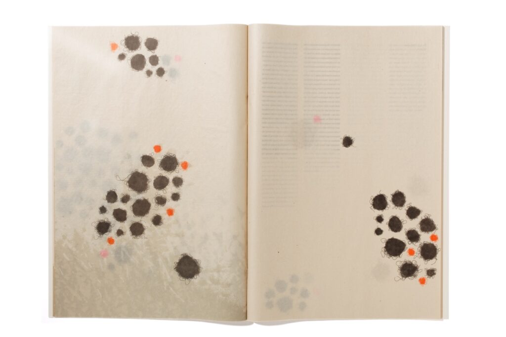
Moving through the long, narrow columns of text in Japanese and German, the reader’s path is interrupted by randomly placed images of what look like wiry dust balls. They are impressions of artificial hair balls of various sizes and colors, inked and printed on thin mitsumata paper.
The skin-toned semi-translucent surface rustles like something alive when you turn the pages, which is apt, given the bodily references of the background imagery—enlarged microscopic prints of skin structures and hair.
There is even more to appreciate in the biological materiality of Die Nase. Not all of the hair balls are printed in ink—some are just oily patches that spread out and stain the wrinkly paper with yellow spots. Now the strange material of the book’s cover begins to make sense.
Schäpers is a master of the slow unfolding of content, and this especially extends to her enclosures and book coverings. She uses them as a thematic introduction to the text before its topic is revealed: acrylic and smooth wooden boxes as specimen cases, felt and silk cloth wrappers, and cleverly engineered slipcases with hidden hinges. In Die Nase, the book’s full sewn-in flexible wrapper feels clinical, like something that you would encounter in a hospital operating room. In fact, it is a synthetic substance used in the medical field, a sly reference to the face-altering procedure of the narrative’s main character. Schäpers’s years spent living in Japan led her to experiment with widely available nontraditional book materials, often from the commercial and industrial sectors. In this case, she covered the book in semi-transparent PVC jelly film, with exposed clear vinyl cords that stretch when pulled. (She has mentioned that she had sebum in mind.) Her ultimate skin metaphor carries the book’s haptic impact to its finale. Tiny neodymium magnets are embedded in the surface, resembling hair follicles. It is exquisitely repellant and thoroughly compelling.
My concluding examination of the language of artists’ books centers on distortion.
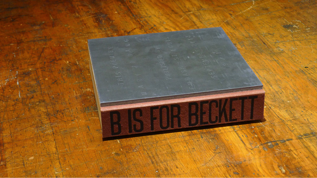
Ken Botnick’s B Is for Beckett (2013) is a collaboration with American poet Mary Jo Bang. Botnick wanted to experiment with printing text on the fore edge of a book, but he knew that this would require either having a very short poem or making a very large book.
emdash, 2013. 8.25 x 8.25 in (21 x 21 cm),
87 pages. Edition of 10. Letterpress printed on
double thick 120 lb cover weight paper, bound in the
notched perfect method with hand-stamped lead
front cover and spine of handmade, hand-dyed flax
by Cave Paper. Photos courtesy Ruth R. Rogers.
The term minimalist is construed to mean anything that is spare or stripped to its essentials. It has also been used to describe the plays and novels of Samuel Beckett, which became more minimalist and absurd with time. Here is where craft meets concept—or where Beckett meets Botnick.
The act of turning pages (87 to be exact) and waiting for the elusive text to be revealed on what appear to be blank sheets is the essence of Beckett. Is it all a joke at the expense of the reader? (Waiting for Godot comes to mind.) Let’s look further.
Through meticulous registration of the type on the fore edge of the paper, which has to be repositioned by a tiny fraction with each press run, Botnick reveals the poem. The words gradually become more apparent as the pages are turned, but one can never see them completely unless the bound book is closed and they appear complete on all three fore edges.
A final nod to Beckett’s delightful subversion is the front cover containing the publication information, or colophon, which, in an artists’ book, is normally printed at the end of the book, inside. Botnick’s colophon front cover is made of lead, but the letters are stamped by hand into the lead, which is the very opposite of type, where the pieces of lead are impressed into paper. This gives extra weight, of course, in addition to double-thick 120-pound cover paper for the text.
The book is a grand joke meant to perturb the reader—its weight is inversely proportional to the amount of text. A thick, heavy book that is mostly blank; one that you can’t fully read unless it is closed. Botnick and Bang created an homage to Beckett in material form and concept. He would surely have approved.
In his book VOC (2022), Clifton Meador also challenges the reader to understand his project through the language of distortion. Meador’s work often investigates place and culture as the basis for identity. It is political without being polemical, using subtly manipulated images to deliver meaning.
6 x 14 in (15 x 35.5 cm), 96 pages. Edition of 100.
Printed by offset lithography in fluorescent colors,
hand sewn and case bound.
Photos courtesy Ruth R. Rogers.
Chartered in 1602, the Dutch East India company—or Vereenigde Oostindische Compagnie, referred to as the VOC—was the first publicly traded corporation in the world. The first page spread of the book is the title page of Adam Smith’s The Wealth of Nations printed opposite the official manuscript charter of the VOC, with lead seals attached. But the words are sliding off the page, the colors are wrong, and everything is out of focus. Could this distorted mise-en-page be a reference to the corruption of wealth and power?
To quote Meador’s own words: “I imagined this project as a museum catalog gone completely wrong: reproductions mangled, images mis-registered, odd fragments recombined from wildly different sources, cropped badly, with colors transformed into something from a hallucination.”[10]
In this unreliable museum catalogue, richly made objects that represent the vast wealth of the Dutch golden age are combined and deformed. Meador downloaded high-resolution images from the collection of the Rijksmuseum, then color-separated and merged them on the page through offset lithography.
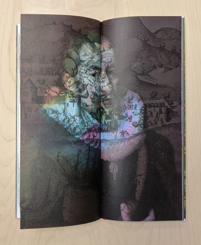
One image is a portrait of one of the wealthy shareholders/owners with a battle scene from a seventeenth-century book superimposed over him. There are no captions, and the reader must find the narrative within seemingly disparate images. Enlarged engravings from early printed books that chronicle colonial domination are layered over photos of domestic objects and people with kaleidoscopic effect.[11]
Shelved in Wellesley College’s Special Collections is another rare book that proudly narrates the power and greed of the VOC: Joris van Spilbergen’s Speculum orientalis (1619). It provides detailed maps and engravings of native inhabitants of East Asian lands, a record of expansion, occupation, and exploitation of resources and people.
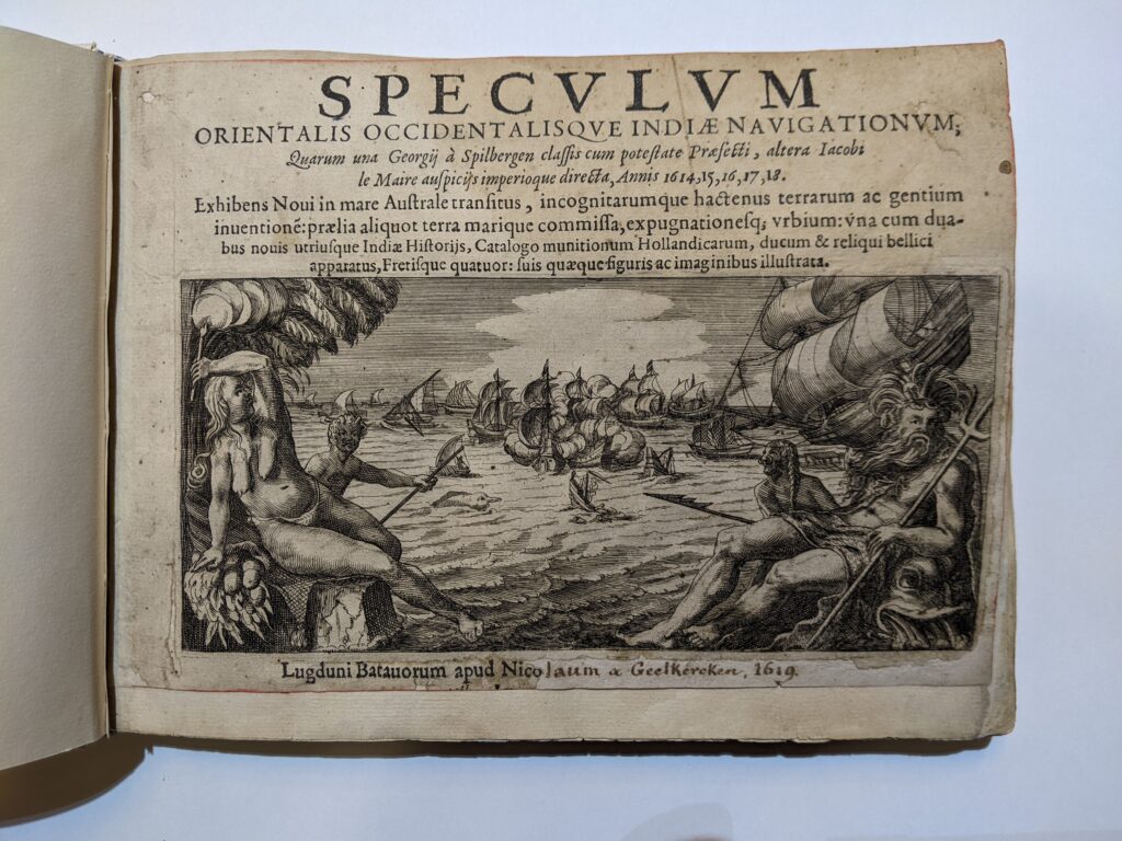
navigationvm, Joris van Spilbergen
Nicolaus van Geelkercken, 1619.
Photo courtesy Ruth R. Rogers.
These two books, published four hundred years apart, speak to each other in the present. Spilbergen trumpets the tenacity and wealth of the Dutch Empire, while Meador uses the same images to refocus the narrative and conversation. In his book, the luxury goods, paintings, exotic spices, and weapons are the spoils of an extractive colonialism. But there is no text. Instead, Meador uses dissonant color and layered, dislocated imagery to provoke the reader’s complacency with the historical narrative.
Outstanding artists’ books like those discussed here do not follow a formula. They avoid clichéd themes and overproduction, pitfalls of books that privilege form over content. Instead, they arouse our interest by speaking with their unique languages. They are memorable precisely because they are enigmatic.
What these books transmit through weight, spatial orientation, pacing, material, and concept will be different for everyone who reads and touches them. Like learning a new language, there is that imprecise moment when one steps into the arena of understanding and speaking without thinking too hard about rules of grammar and sentence construction.
Could there be a better vessel for multisensory communication than the artists’ book? The answer lies in these questions: Do you think about the book long after you have seen it? Do you experience it differently upon returning to it? Where in the body does this experience lie? If you are provoked, engaged, and ultimately sustained by an artists’ book, you have understood its language.
Books Addressed
- Romano Hänni. Es ist bitter, die Heimat zu verlassen [It is bitter to leave your home]. Basel, Switzerland, 2017.
- Eileen Boxer. Report US: The Dailies. Brooklyn, NY, 2016.
- Patrizia Meinert/William Shakespeare. Ophelia. Halle, Germany, 2012.
- Sara Langworthy/James Clerk Maxwell. On Physical Lines. Iowa City, 2015.
- Carolee Campbell/Nathaniel Tarn. The Persephones. Sherman Oaks, CA: Ninja Press, 2009.
- Veronika Schäpers/Ryūnosuke Akutagawa. Die Nase [The nose]. Tokyo, Japan, 2009.
- Ken Botnick/Mary Jo Bang. B Is for Beckett. St. Louis, MO: emdash, 2013.
- Clifton Meador. VOC. Boone, NC: Studio of Exhaustion, 2022.
- Joris van Spilbergen. Specvlvm orientalis occidentalisqve Indiæ navigationvm. Leiden, 1619.
- Martin Luther. Das Newe Testament Deutzsch. Wittemberg, 1524.
- (1)
Expanded version of a talk delivered at the Luminous Books Symposium, Boston Athenaeum, March 10–11, 2023.
- (2)
Susan Sontag, Essays of the 1960s & 70s, ed. David Rieff (New York: Library of America), p. 40.
- (3)
Kenneth Botnick, Enid Mark Lecture, Smith College. April 23, 2015.
- (4)
Johanna Drucker, “Entity to Event: From Literal, Mechanistic Materiality to Probabilistic Materiality,” Parallax 4, Vol. 15 (October–December 2009), pp. 7–17.
- (5)
Other Langworthy books on themes of physics and astronomy are Solid Phases (2012) and Sidereal (2019).
- (6)
James Clerk Maxwell, On Physical Lines of Force,. 4th ed. (London, 1872).
- (7)
Email from SL to RR, July 24, 2019.
- (8)
Johanna Drucker, “Entity to Event: From Literal, Mechanistic Materiality to Probabilistic Materiality,” Parallax 4, Vol. 15 (October–December 2009), pp. 7–17.
- (9)
Walter Burkert, Homo Necans: The Anthropology of Ancient Greek Sacrificial Ritual and Myth (Berkeley, CA: University of California Press, 1983).
- (10)
Clifton Meador, “VOC Project Statement,” https://clifton-meador.com/VOC-project-statement.
- (11)
Meador reproduced an image of the title page of the infamous account of the 1623 Amboyna Massacre, in which the VOC was responsible for the deaths of Indigenous people and Englishmen in the service of the East India Company.