Abracadabra: Letterform, Technology
About the Exhibition
Typography is a good model for observing perception because, with its strict rules, it creates an artificial laboratory-like workspace that everyone has within his or her reach. The relationship between shape and counter shape, which in writing amounts to the relation between black and white, is the foundation of perception—the interpretation from any sense organ relies on this principle of contrast.
—Gerrit Noordzij
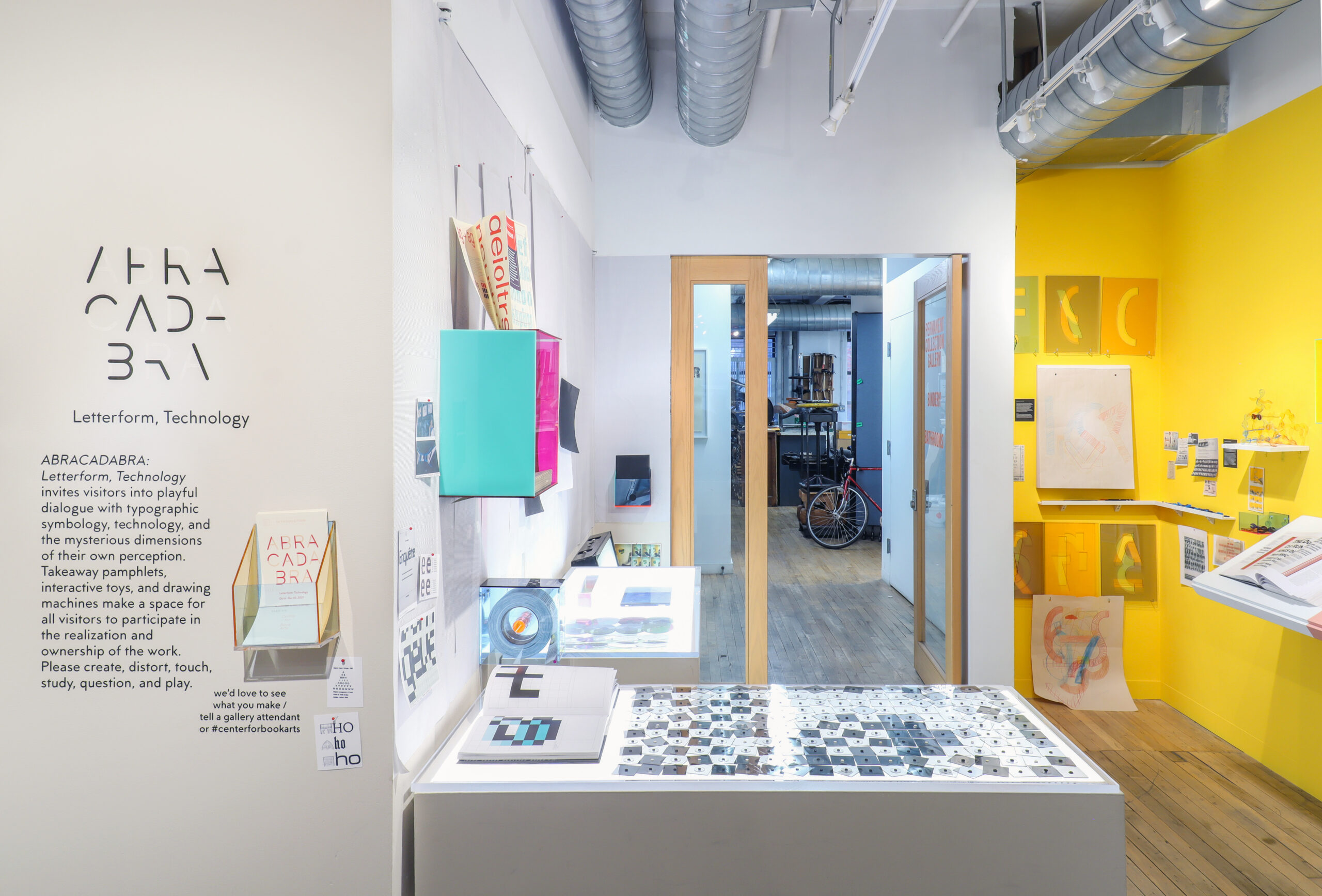
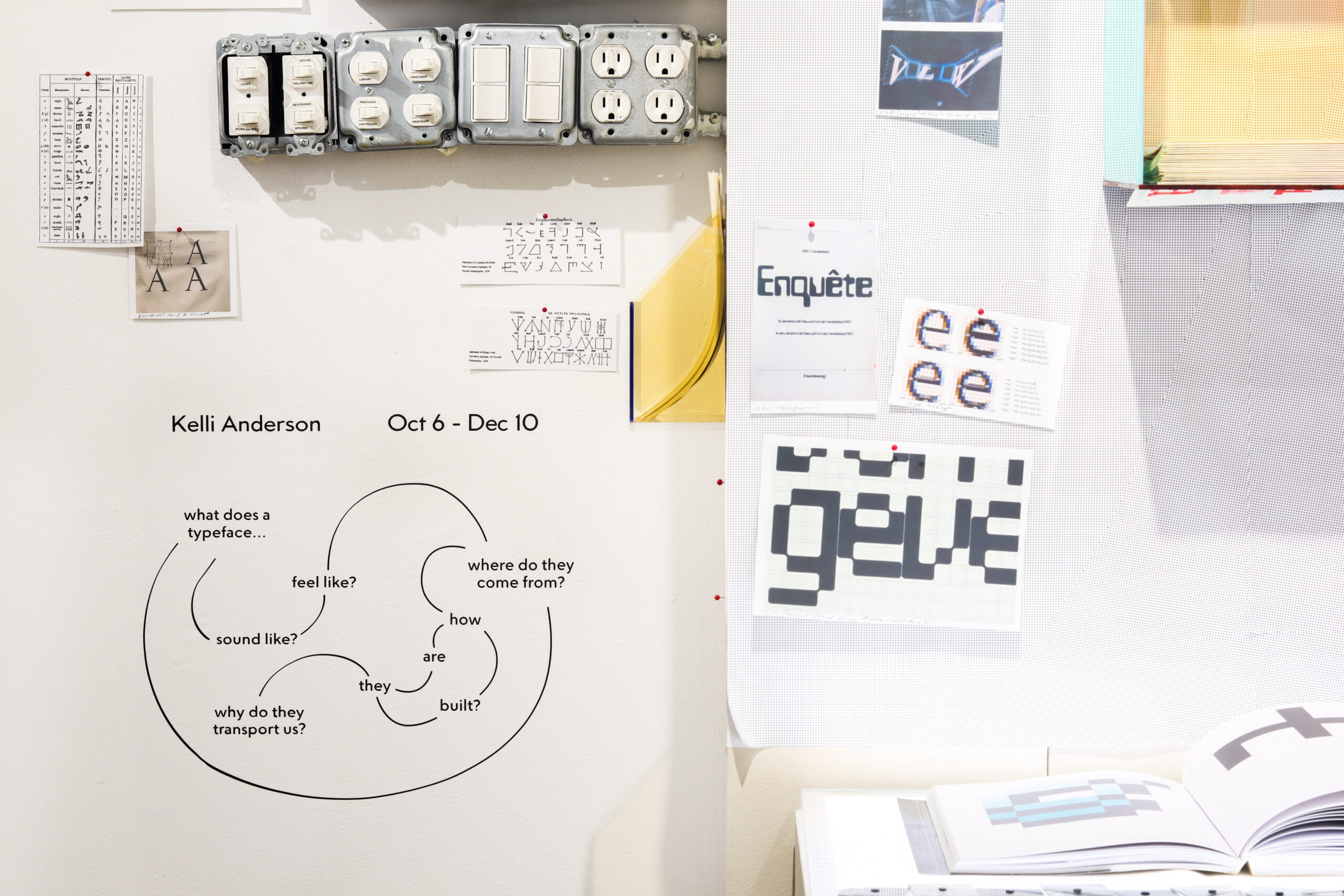
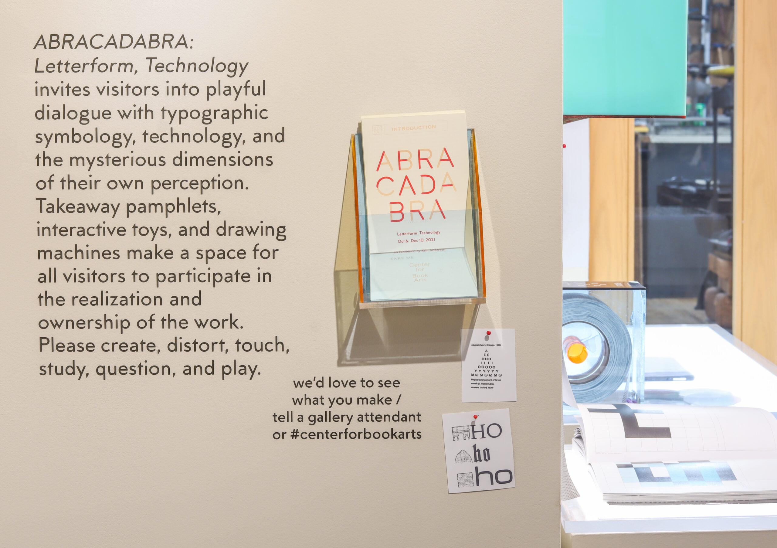
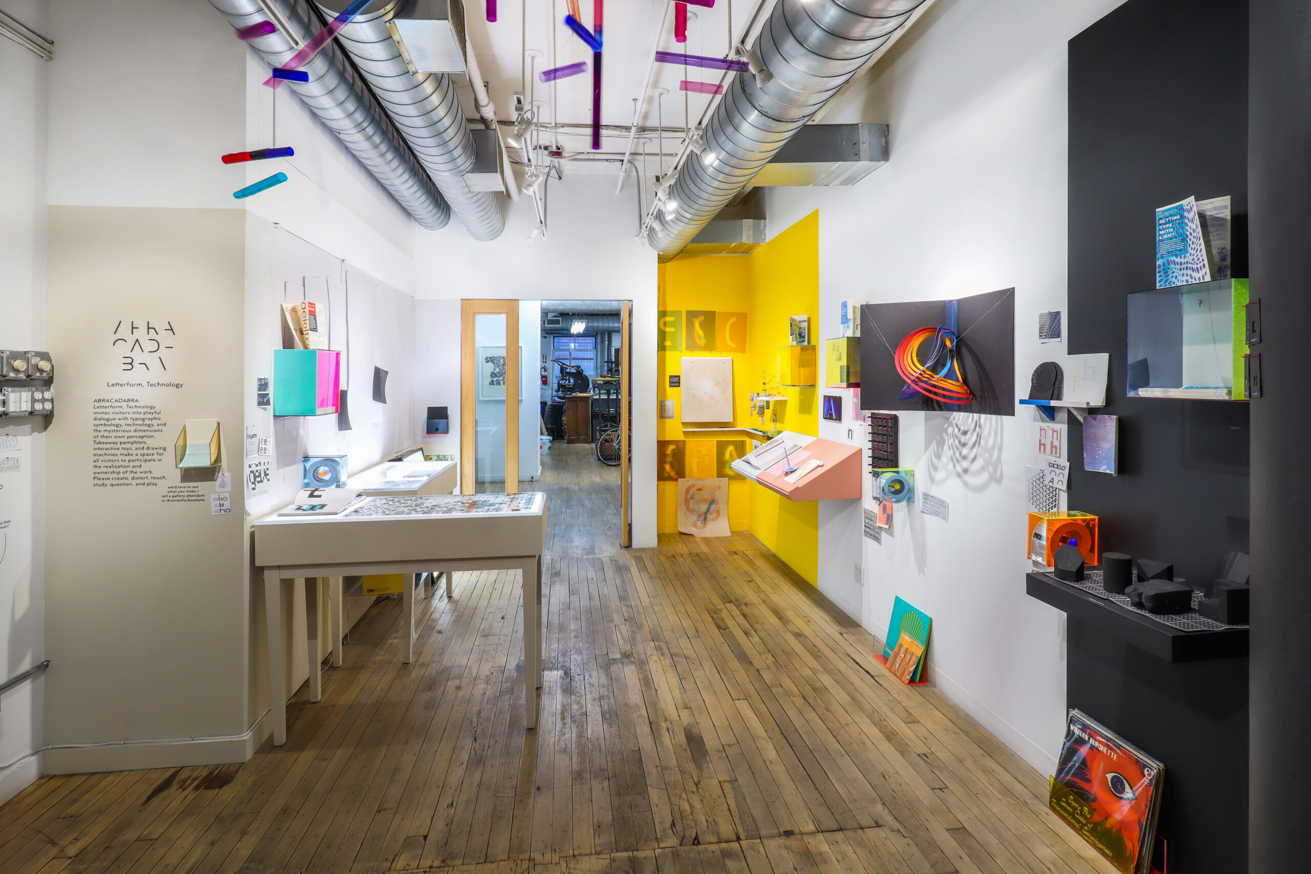
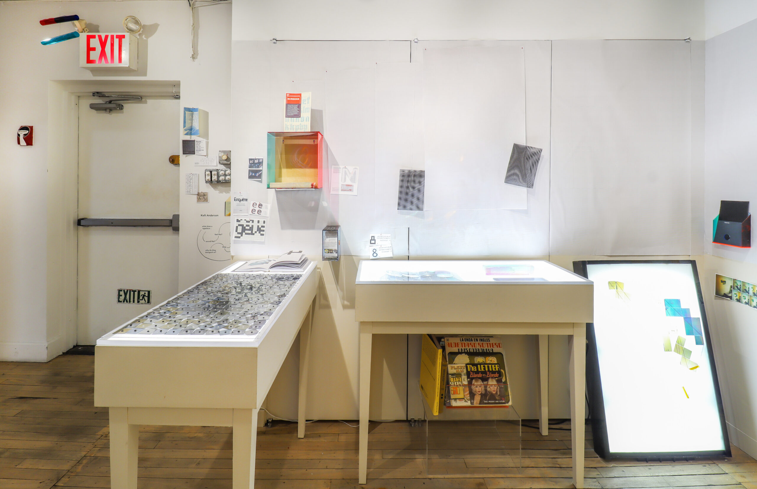
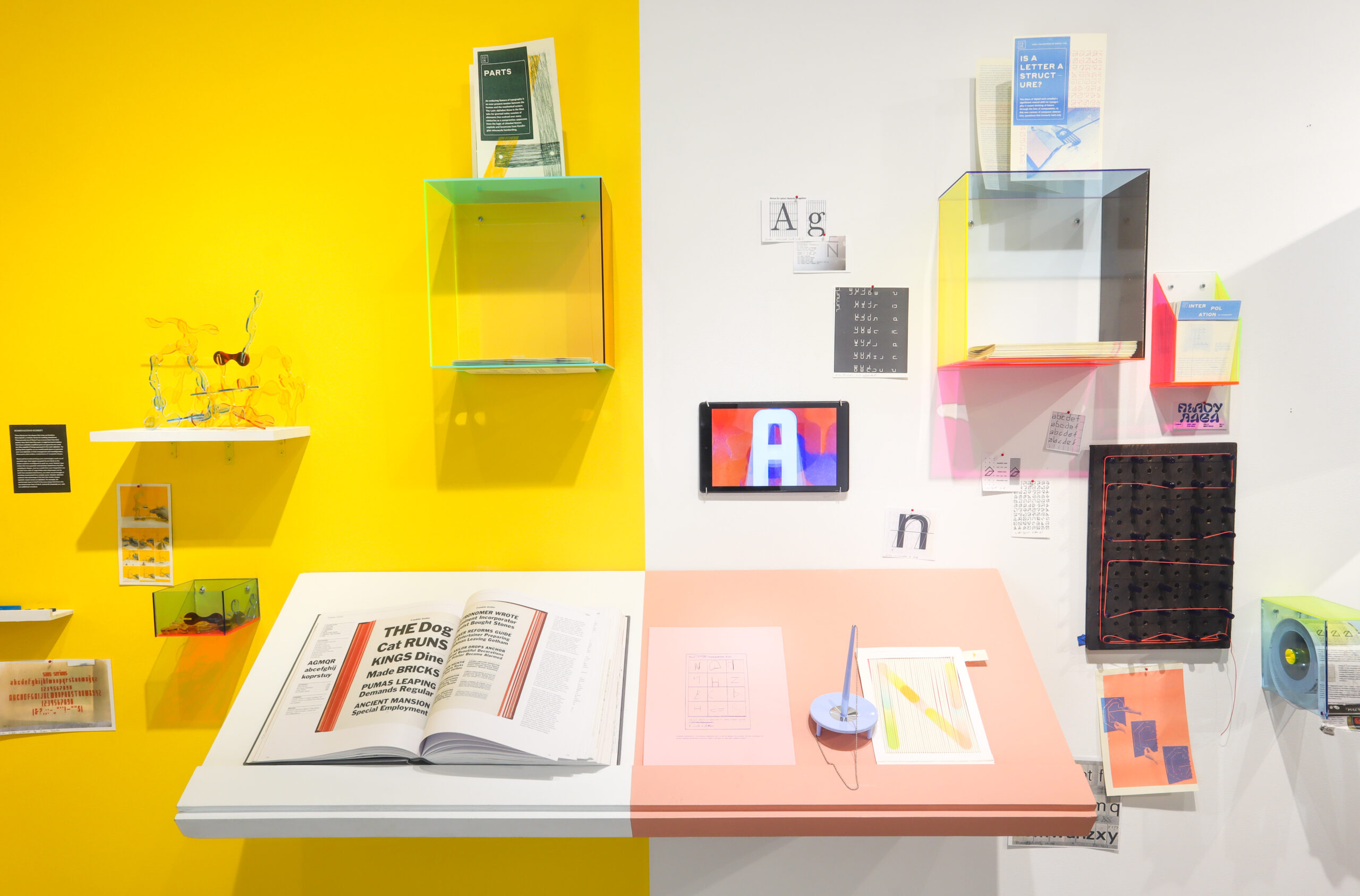
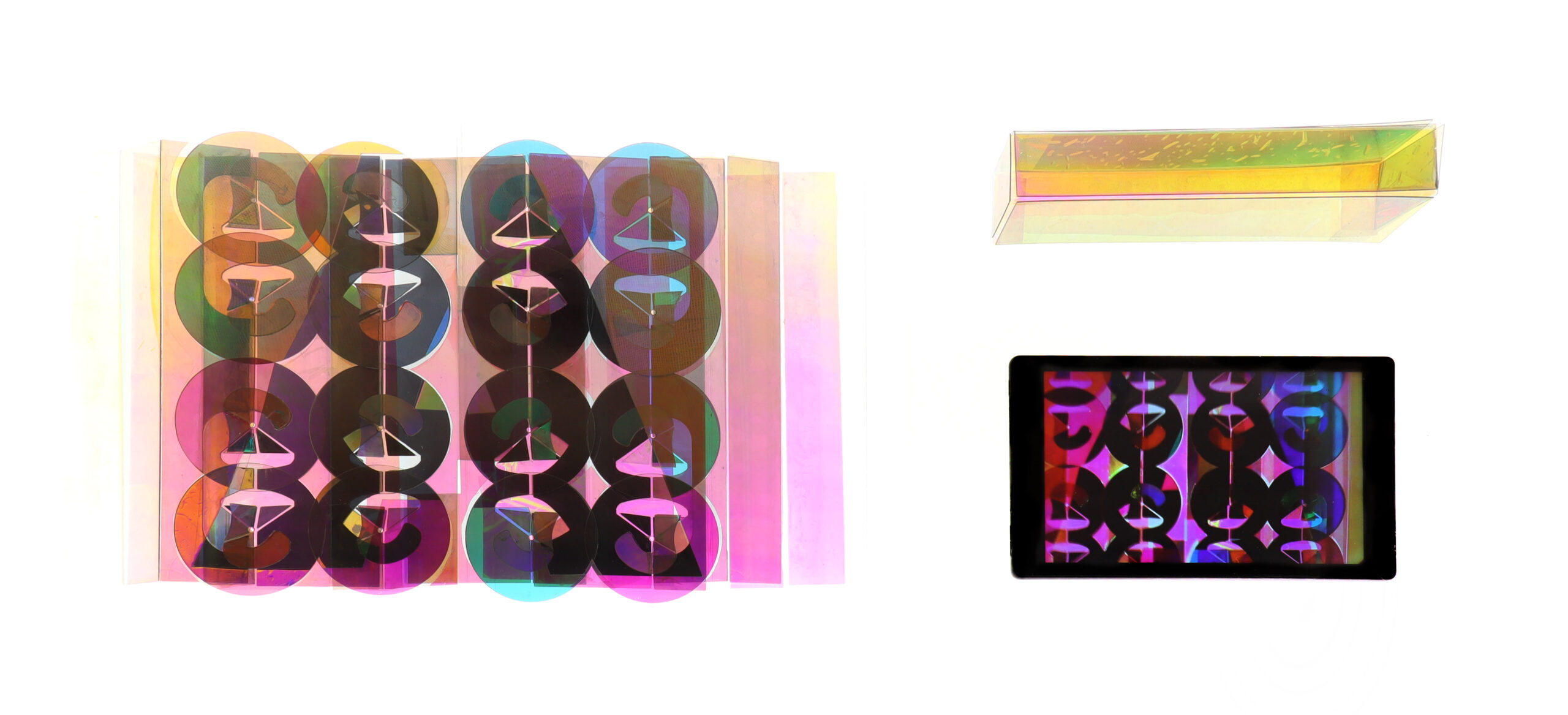
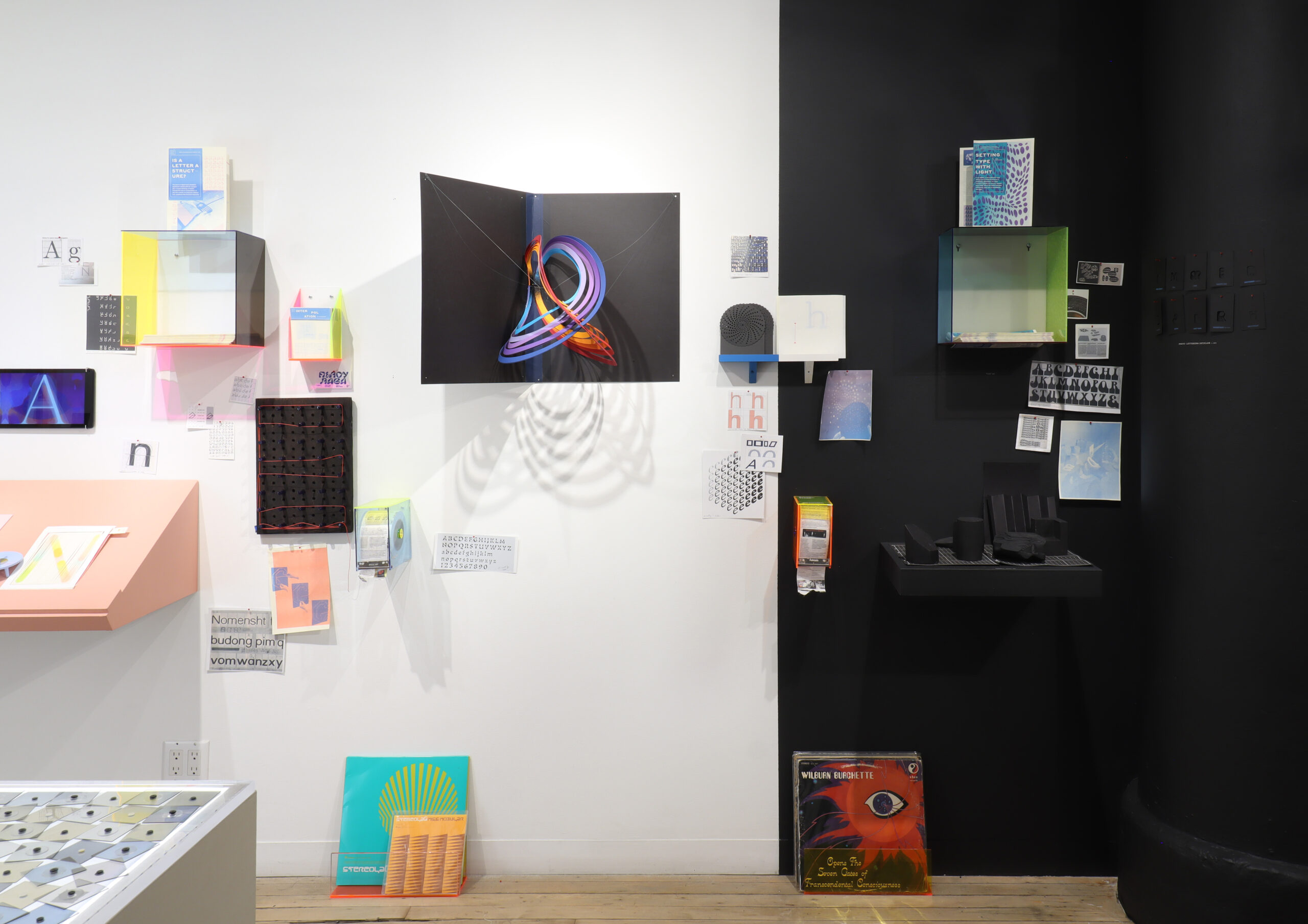
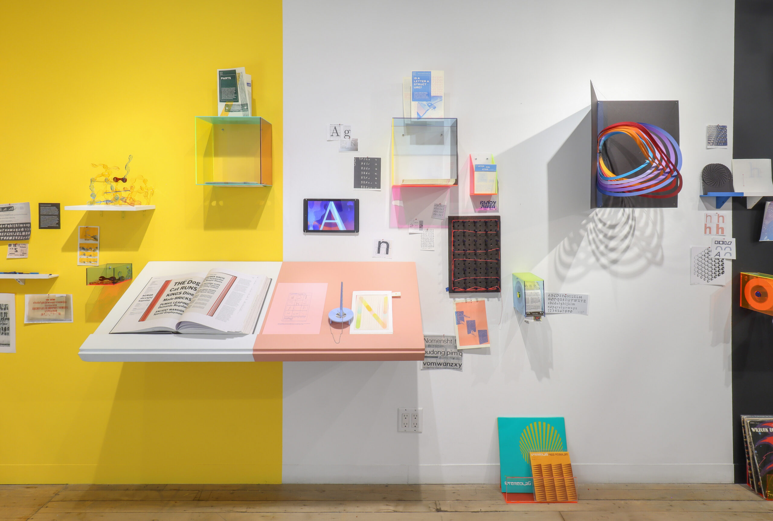
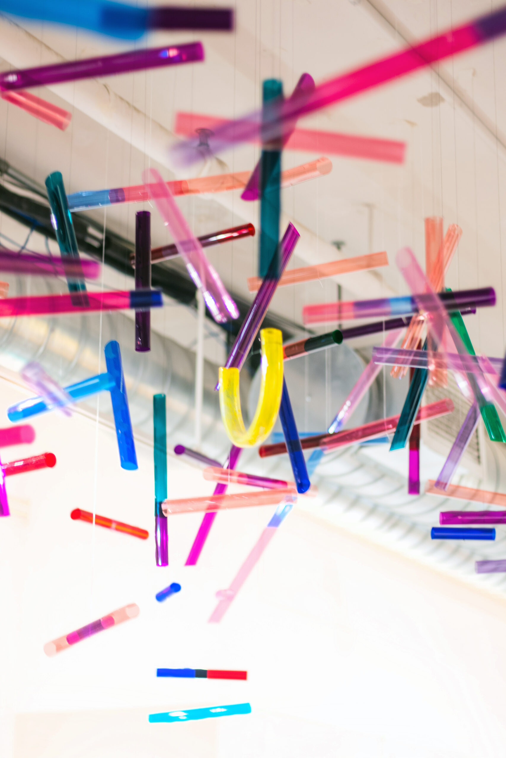
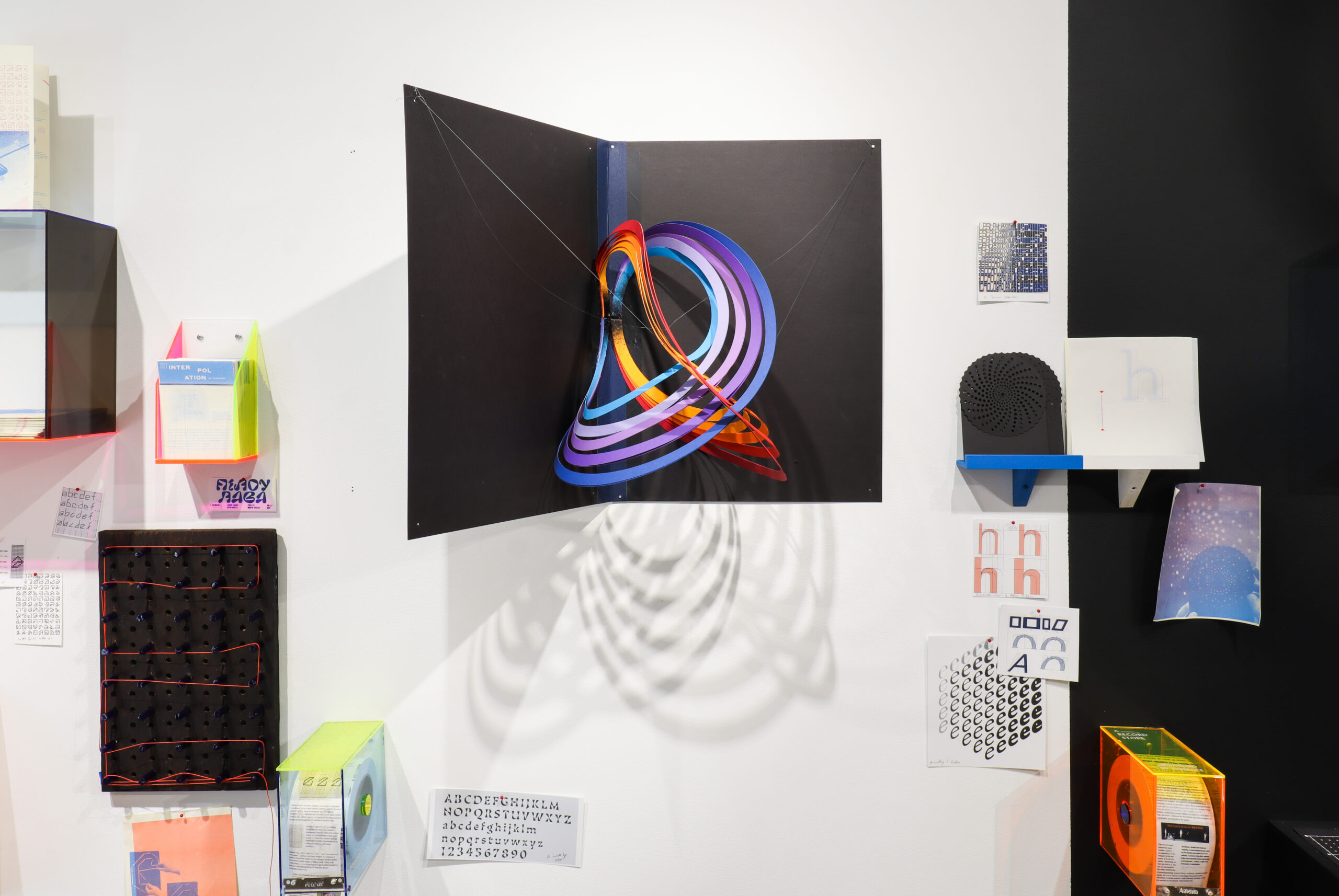
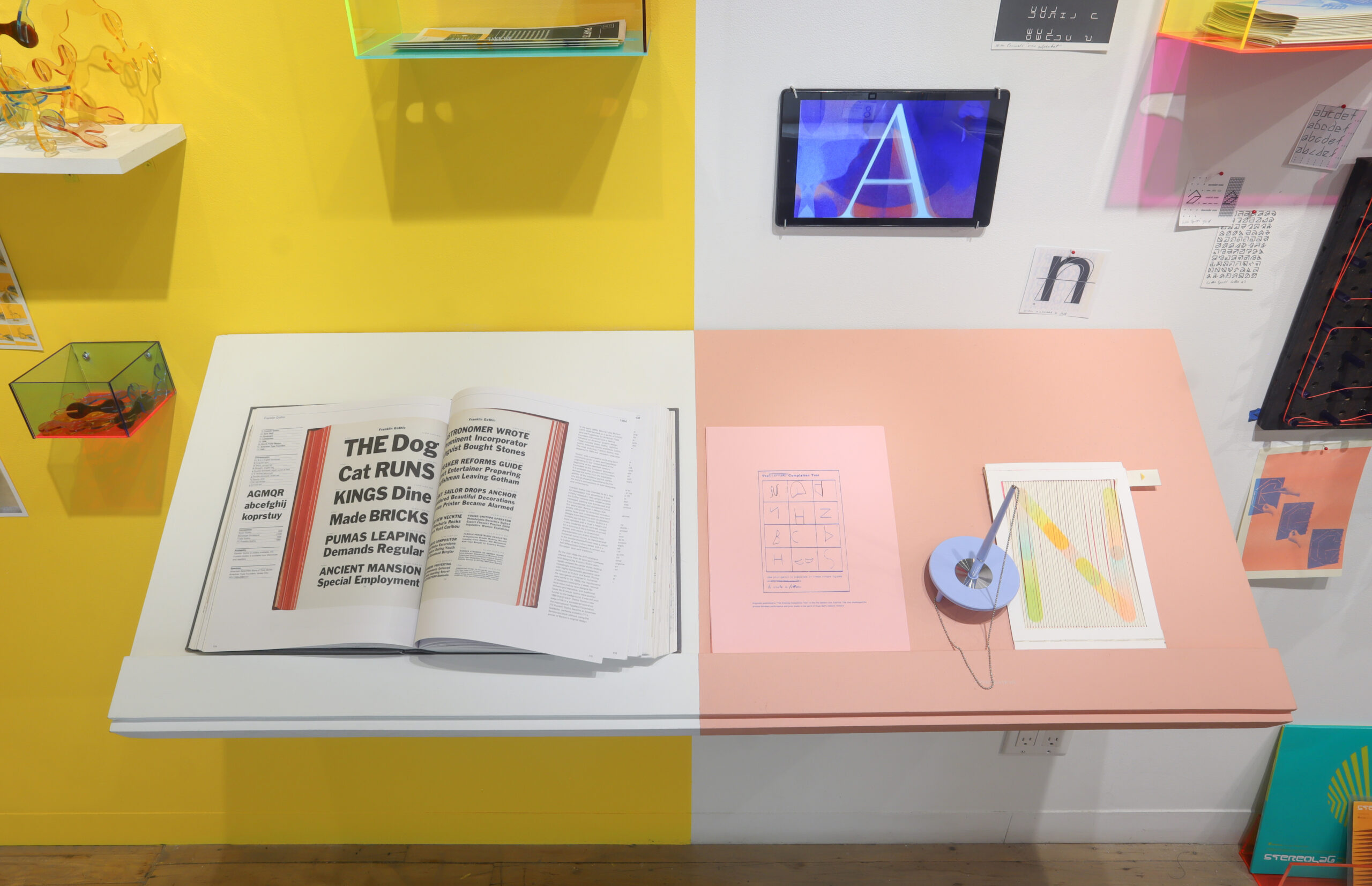
ABRACADABRA: Letterform, Technology invites visitors into playful dialogue with mysterious dimensions of typographic symbology, technology and their own perception. The exhibition aims to break down barriers between artist and audience—constructing a democratic space for all visitors to participate in the realization and ownership of the work. It does so by presenting takeaway interactive elements, pamphlets, prompts to create letterforms, and collaborative thought-experiments.
At a mere glance, typography might transport us—the shape of a letter might conjure a debate over anything from aesthetics to philosophy. For example, one might be reminded of the Roman Empire while gazing upon stately uppercase serif letterforms, without realizing why. The first serifs were, in fact, wedge-shaped artifacts—the shape left behind when chisel pummels stone. A serif originated as the mark left by the technology of a ravenous empire.
It is with such an economy of expression that tiny typographic shapes connect us to an aesthetic and emotional experience of history and technology. On every bodega’s awning, post office’s signage, in Microsoft Office and in Google docs, in discarded electronics bins, there are letters embedded with different ideas about what civilization should be. Typography offers us all a handheld play-space to connect to these ideas through our own perceptual sensitivities.
Kelli Anderson
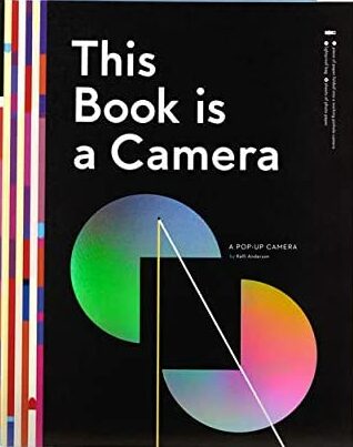
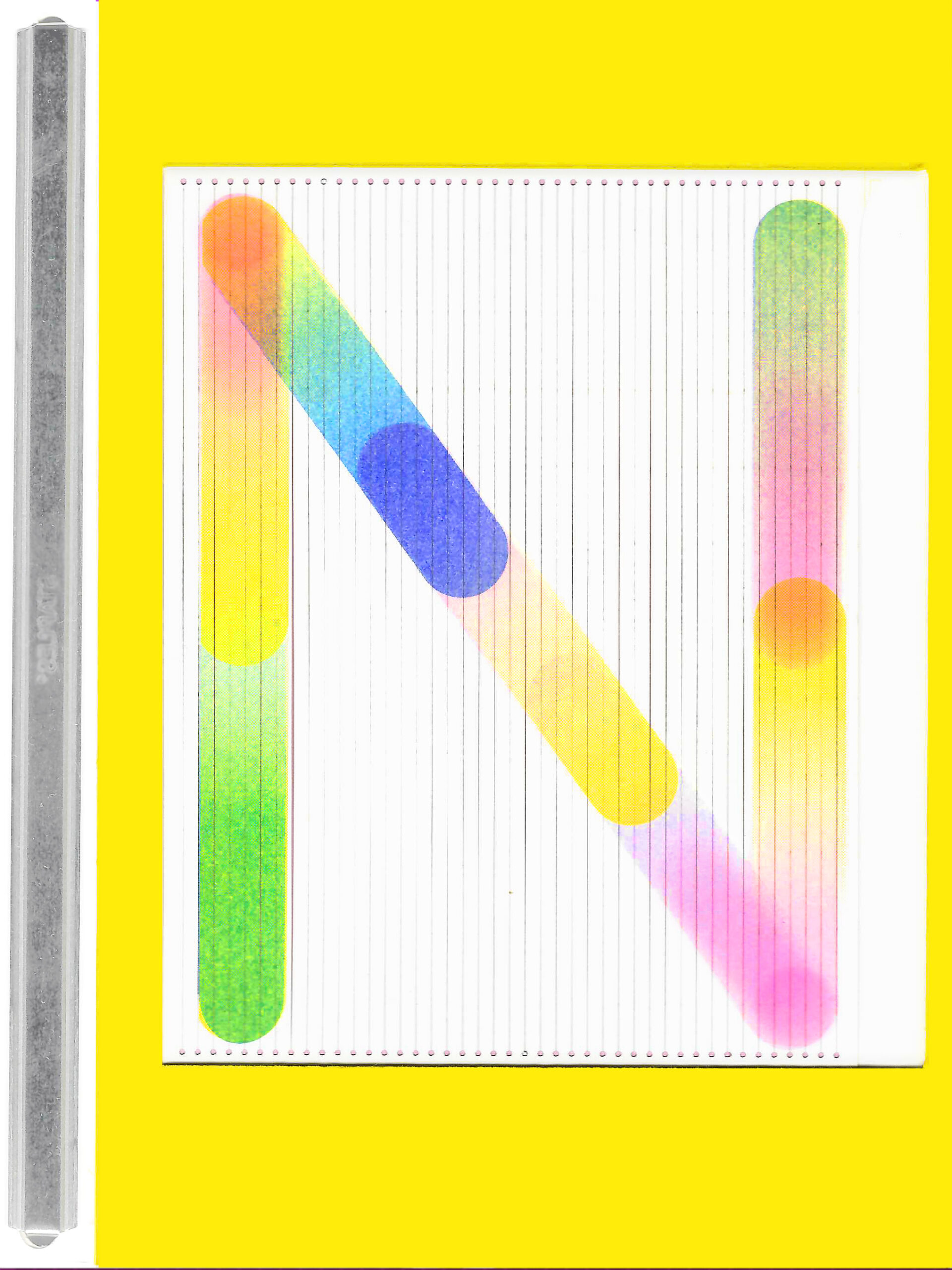
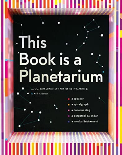
Kelli Anderson is an artist, designer, animator, and tinkerer who pushes the limits of ordinary materials to seek out possibilities hidden in plain view, in humble materials. Her books and projects have included a pop-up paper planetarium, a book that transforms into a pinhole camera, a working paper record, and techniques for misusing RISO to create tactile, inky animations. Intentionally lo-fi, she believes that humble materials can provide entry into the endless, tunneling complexity of our world, making those wonders accessible on a multi-sensory, rich, human level. By opening “black box” concepts up to the poetics and playfulness of the senses, her projects function as a lab space for collaborative through, thereby broadening accessibility and the diversity of voices at the table. She is currently completing Alphabet in Motion, an interactive book on the relationship between typography and technology with Letterform Archive.
