A Flexible Matrix: The Calligraphic Typeface Used to Print the Theuerdank, 1517
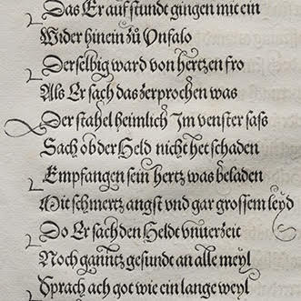
In 1517, Johann Schönsperger the elder printed the Theuerdank for Emperor Maximilian I, using a typeface based closely on the calligraphy of Vincenz Röckner. The type is such a close facsimile of calligraphy, in fact, that at first glance it is hard to believe it is cast and set in metal. In order to achieve this appearance, the artisans who created the type took a radical approach to the typographic page, designing a typeface that is composed both horizontally and vertically. By making use of a vertical compositional axis, letters could be set in such a way as to align with ornamental swashes above and/or below, allowing the same letter to look as if it had multiple variants. The resulting composite letterforms created a unique typographic page, and laid the ground work for later composite typefaces such as Alpha-Blox. In this talk, Maret will use high resolution images of the Theuerdank type to analyze its composition and demonstrate the type’s remarkable alphabetical potential.
The Legacy Press Series is presented in partnership with the New York Chapter of the Guild of Book Workers.
If you would like to join us via livestream, you can access the talk here:
https://www.youtube.com/watch?v=aiFcOo484TA
This in-person event will be held at Center for Book Arts, 28 W. 27th St, 3rd Floor, on Thursday, November 17 at 6:30pm.
Presenters
Russell Maret is a book artist and type designer working in New York City.
28 West 27th St, 3rd Fl
New York, NY 10001
212-481-0295
